Certainly, the tombstone's visual language is nowhere near as sophisticated as the Cameron poster - rather than the careful sequential progress from Cameron's face in the optimal zone of attention to the final sales pitch, the reader's eye is first drawn to the tombstone (which in a sense stands in for the face), presenting them with a totally decontextualised piece of policy argument (the clip-art stone and R.I.P OFF could be a Mike's Carpets ad - what's a rip off? why is there a tombstone here?), proceeding to the rant, and then leaving you with nothing much. The mention of the Conservative Party, which is the finale and the call to action, is stuffed up in the top right, off the main line of the plot and in a place you usually put visual elements to get them out of the way.
Nobody puts a newspaper headline or masthead in the top right hand corner of the page; computer user-interface designers usually put things like logout links or "close window" buttons there so you don't accidentally click them. Not surprisingly, I felt the parody versions to be slightly unsatisfying compared to the Cameron poster, and at least going by traffic, the Internet public felt the same. The Cameron poster was a classic - a high-style product of the visual language of the corporate and governmental elite, as carefully designed as anything Apple or Porsche produce. It just begged to be subverted.

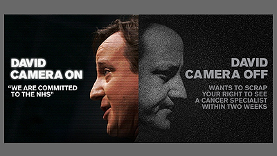
Well, what can we say about this? First of all, there's the block colour - an entirely black backdrop. Obviously this connotes seriousness, but more importantly, it signals a very different approach compared to the colour-of-nothing in the first Cameron poster. Rather than trying to avoid our conscious attention, it demands the foreground.
Secondly, it's much more complicated than either Tory poster. For a start, it includes a joke; R.I.P OFF barely counts. David Camera On is actually funny, at least in part because it's unavoidable - it hits exactly the image and persona he's spent so much effort cultivating. If you put yourself on a poster like the Cameron one, there's no way you can dodge this. A joke implies plot - the set up, then the punchline. The viewer is being invited to look for the punchline, indeed to come up with one themselves, and the organisation of the poster with its not-quite symmetrical halves leads us to it. The highlighting of the text on the left also plays a role in this, as well as acting as a sight gag about the camera.
Also, the well-lit Dave on the left, close to the optimal attention zone, acts as a beacon for the whole thing (rather like he does for the Cameron poster). The arresting image is there, however, to feed us into the joke. Framing a face emerging from darkness in the movies usually means we're meant to pay close attention to what the actor is about to say. Probably it's a secret of some sort - we're becoming complicit in the plot. The function of the joke is to set us up for the policy message directly below it.
You'll observe that this makes considerably greater demands on the viewer than either Tory effort. And it insists that the viewer takes part in the drama. This may be why the designers felt they could do without an explicit call for action - laughing at David Cameron is, after all, a political act.
How would we go about mocking this? It strikes me as more difficult than either Tory poster. A joke, after all, is hard to alter fundamentally without breaking something. The plot is considerably more complex. No doubt you could replace the central image, but you're unlikely to find a photo of Brown looking as orange as left-hand Cameron anywhere. The best solution I can think of is to repurpose it as a generally nihilist one - Camera On. Camera Off. They're all at it. Rub their noses in it on May 2nd. Or perhaps: Camera On. Camera Off. Who cares? We're all on CCTV anyway.
No comments:
Post a Comment